Definition for WCAG 2.0 success criterion 1.4.3
1.4.3 Contrast (Minimum): The visual presentation of text and images of text has a contrast ratio of at least 4.5:1, except for the following:
- Large Text: Large-scale text and images of large-scale text have a contrast ratio of at least 3:1;
- Incidental: Text or images of text that are part of an inactive user interface component, that are pure decoration, that are not visible to anyone, or that are part of a picture that contains significant other visual content, have no contrast requirement.
- Logotypes: Text that is part of a logo or brand name has no minimum contrast requirement.
The intent of this Success Criterion is to provide enough contrast between text and its background so that it can be read by people with moderately low vision.
Text that is decorative and conveys no information is excluded. For example, if random words are used to create a background and the words could be rearranged or substituted without changing meaning, then it would be decorative and would not need to meet this criterion.
Text that is larger and has wider character strokes is easier to read at lower contrast. The contrast requirement for larger text is therefore lower.
Note: normatively, this success criterion is only concerned with "text and images of text". It does not cover icons, graphics, or any other elements of the page - even if these are used as the only visible label/indicator for interactive controls, to convey information, or similar.
Testing success criterion 1.4.3
Input into spreadsheet
- Fail
- The page contains text with a foreground/background color combination that falls below the 4.5:1 / 3:1 for large text threshold.
- Pass
- All foreground/background color combinations used for text in the page (with the exception of incidental text/images of text and logotypes) have a contrast ratio of at least 4.5:1 / 3:1 for large text.
How to test
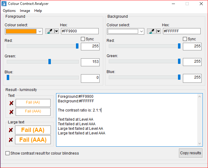
- For text/images of text present on the page, review all foreground/background color combinations using a manual tool such as TPG's Colour Contrast Analyser
- If the page contains dynamically changing elements or styles, ensure that you trigger and test these - for instance, if text inputs have a different visual presentation when they are focused, or if an error message is shown after attempting to submit an incomplete form, ensure that you test these states of the form as well.
The following screenshot shows TPG's Colour Contrast Analyser reviewing foreground and background colors from a web page.